Knewin is a data technology company that develops solutions for reputation management and brand strategy. In this project, I led the UX/UI design process, executind the discorey, mapping, designing the wireframes and interactive prototype in Figma. And developed the front-end of the custom WordPress theme with HTML, CSS (Sass), and JS (React).
✦ Key outcome
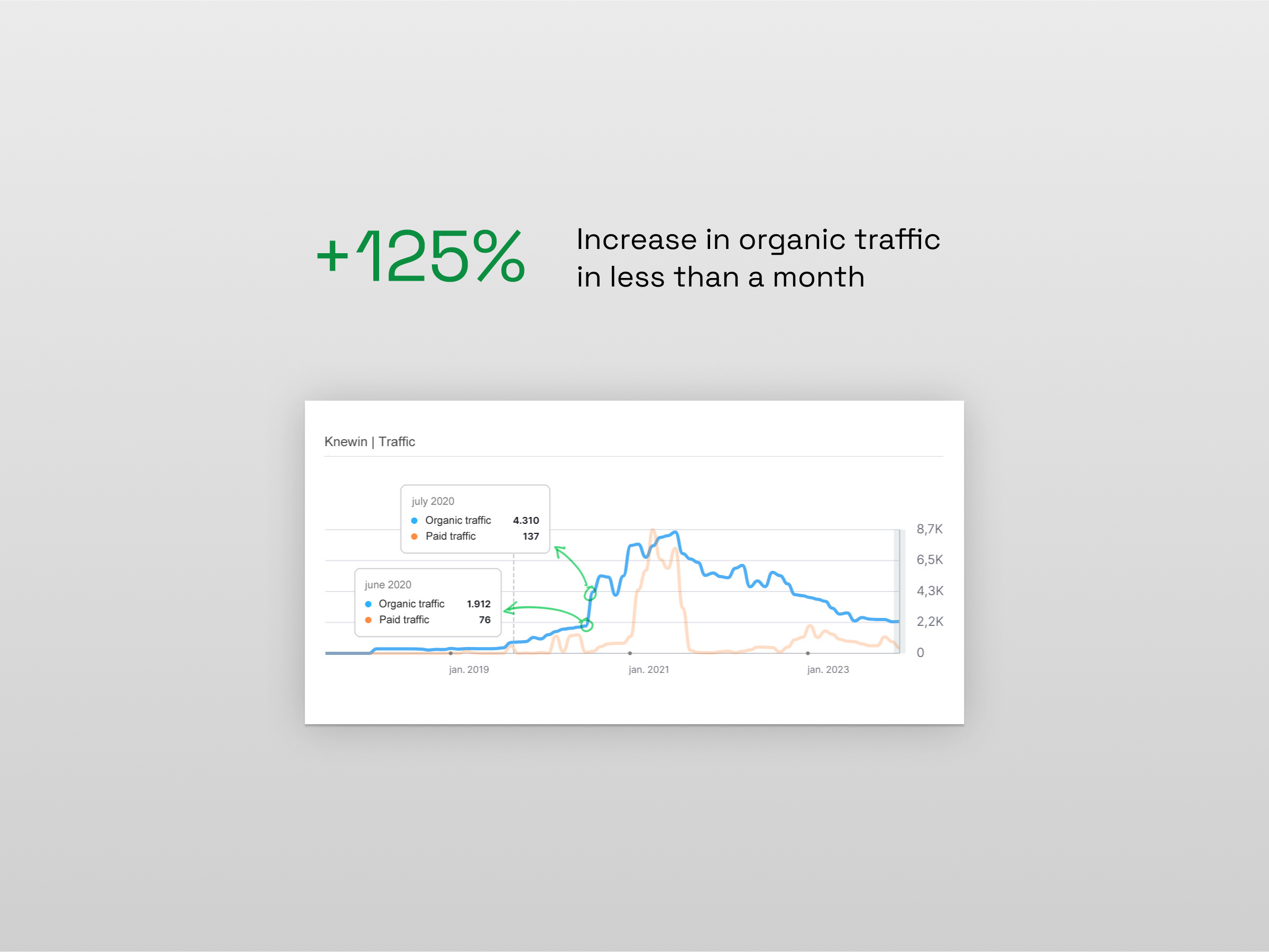
+125% increase in the website’s organic traffic in less than a month.
Impact
The new Knewin website was launched in June 2020. With the launch, the organic traffic of the site more than doubled in less than a month and continued to grow in the following months. The client reported a significant improvement in all other metrics as well.
Knewin’s internal marketing team took over the management of the website and could then focus their efforts on campaigns and other projects.
Case study
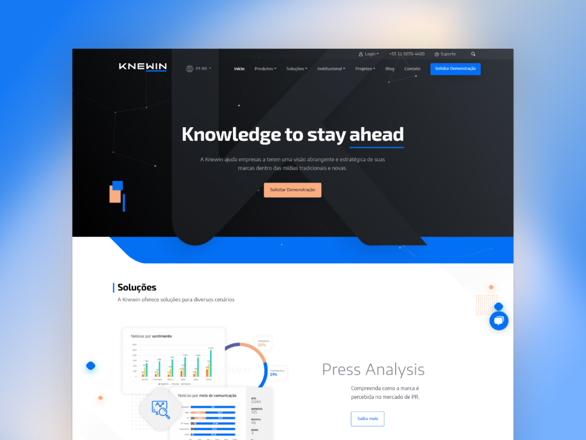
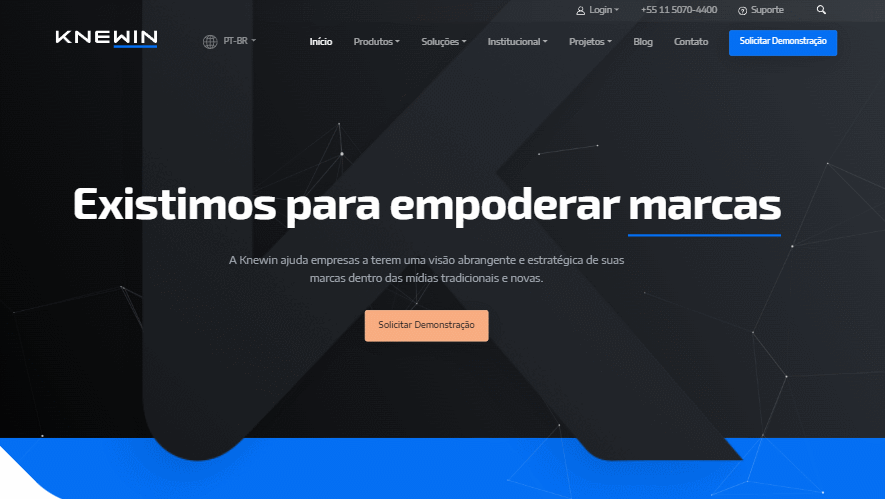
Rethinking the website from the ground up
During the discovery phase, we identified the following main objectives:
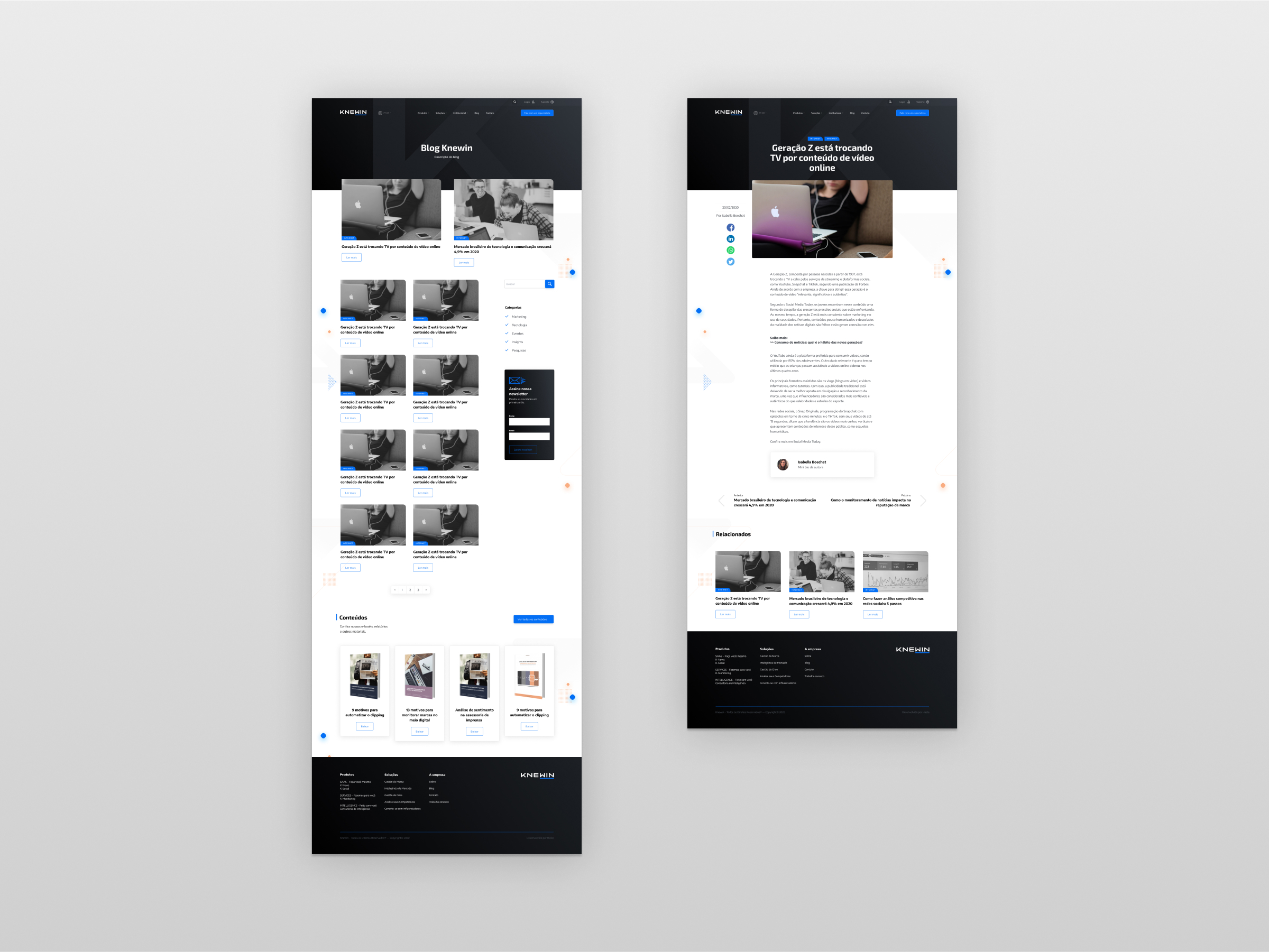
- Improve the website’s structure in terms of user experience, SEO, information accessibility, and lead capture;
- Revamp the site’s visuals to reflect the new and more modern brand identity that would be launched simultaneously;
- Improve the website management process for Knewin’s internal team. Including designing the website to be entirely built with the block editor.
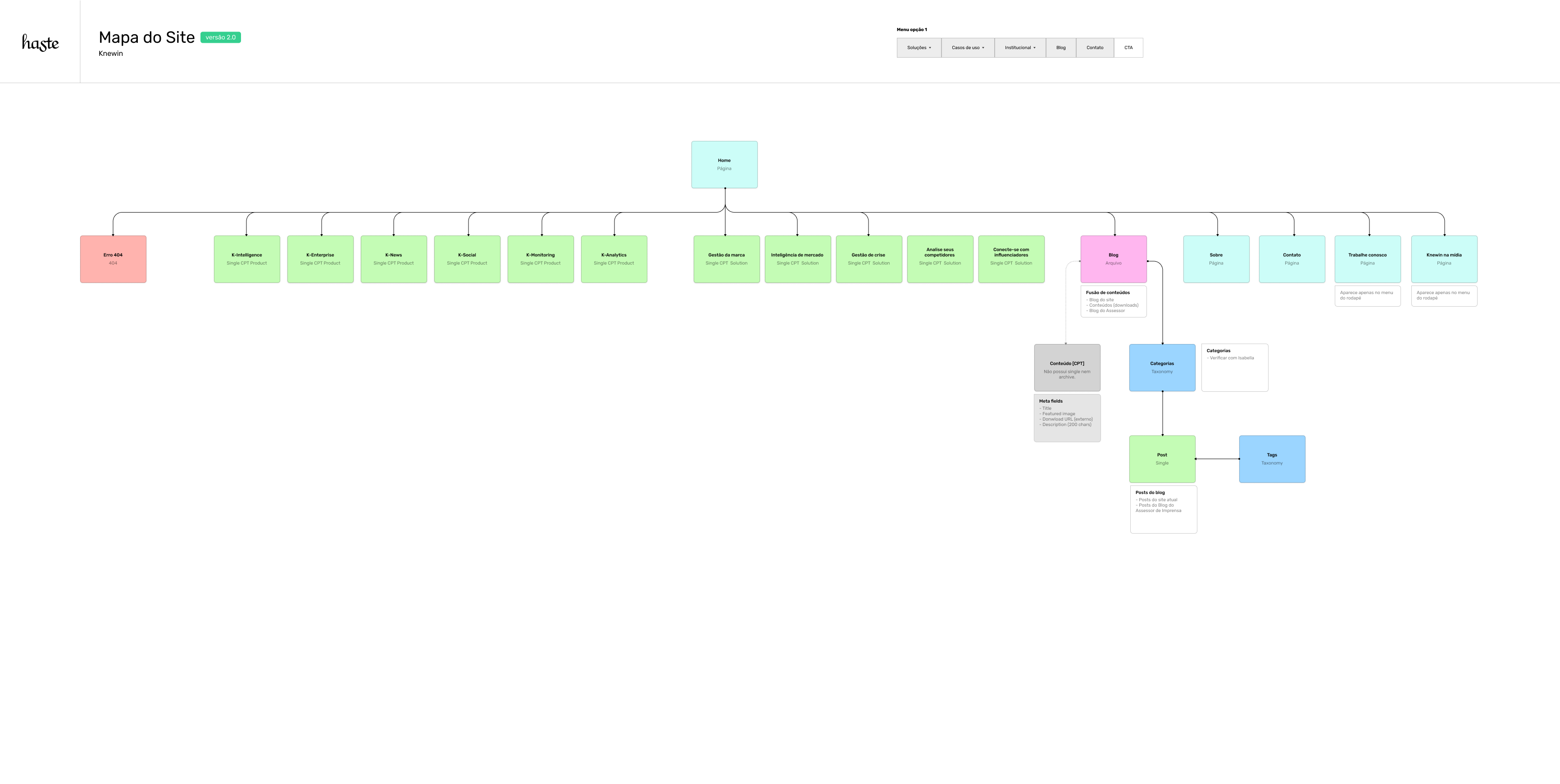
With the start of the discovery and information gathering process, I began mapping out the website’s structure. The goal was to establish not only the necessary pages but also how each part of the content would be developed in the WordPress logic: post types and their properties, taxonomies, archives, singles, etc.
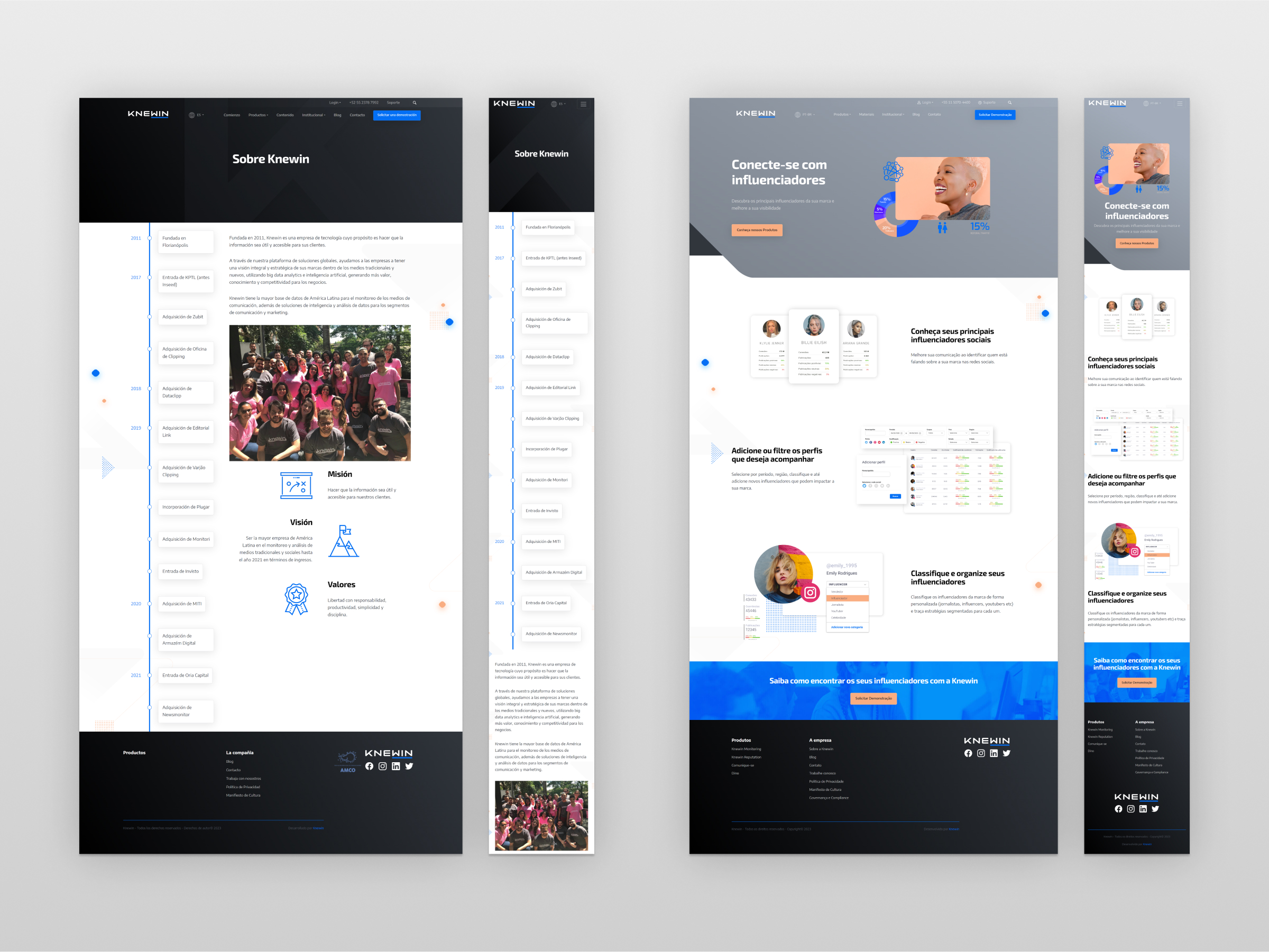
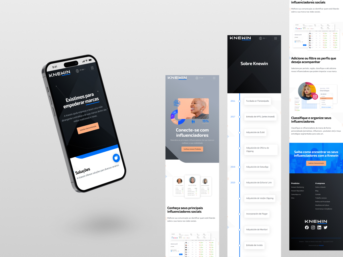
A fresh new branding identity
When the project for the new website began, Knewin’s new visual identity was still being finalized. Therefore, there was not yet a style guide or even a brand guide for reference.
The website would then be the first piece to fully incorporate the new design. And with this responsibility, there was the challenge of being able to expand the new visual language in a direction that not only met the project’s objectives but also set standards for the company’s design from this point onward.
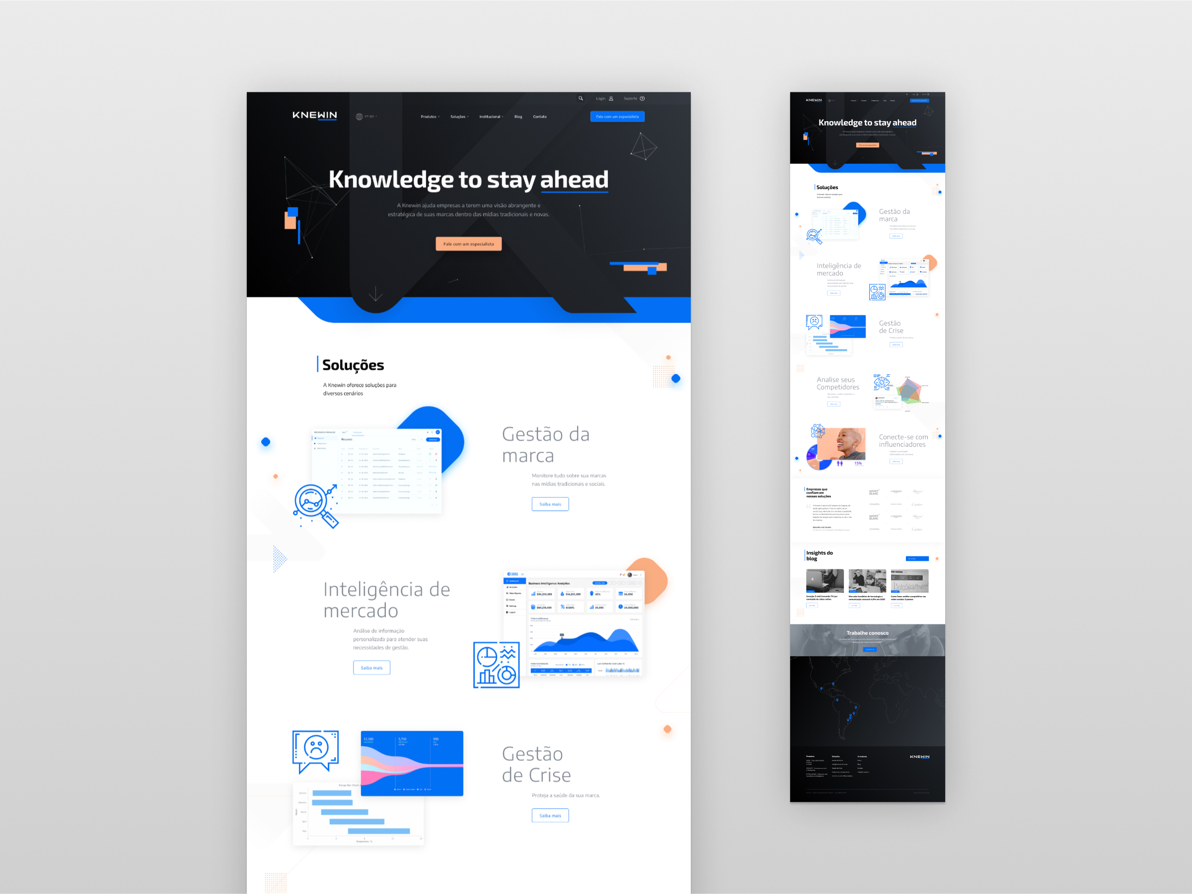
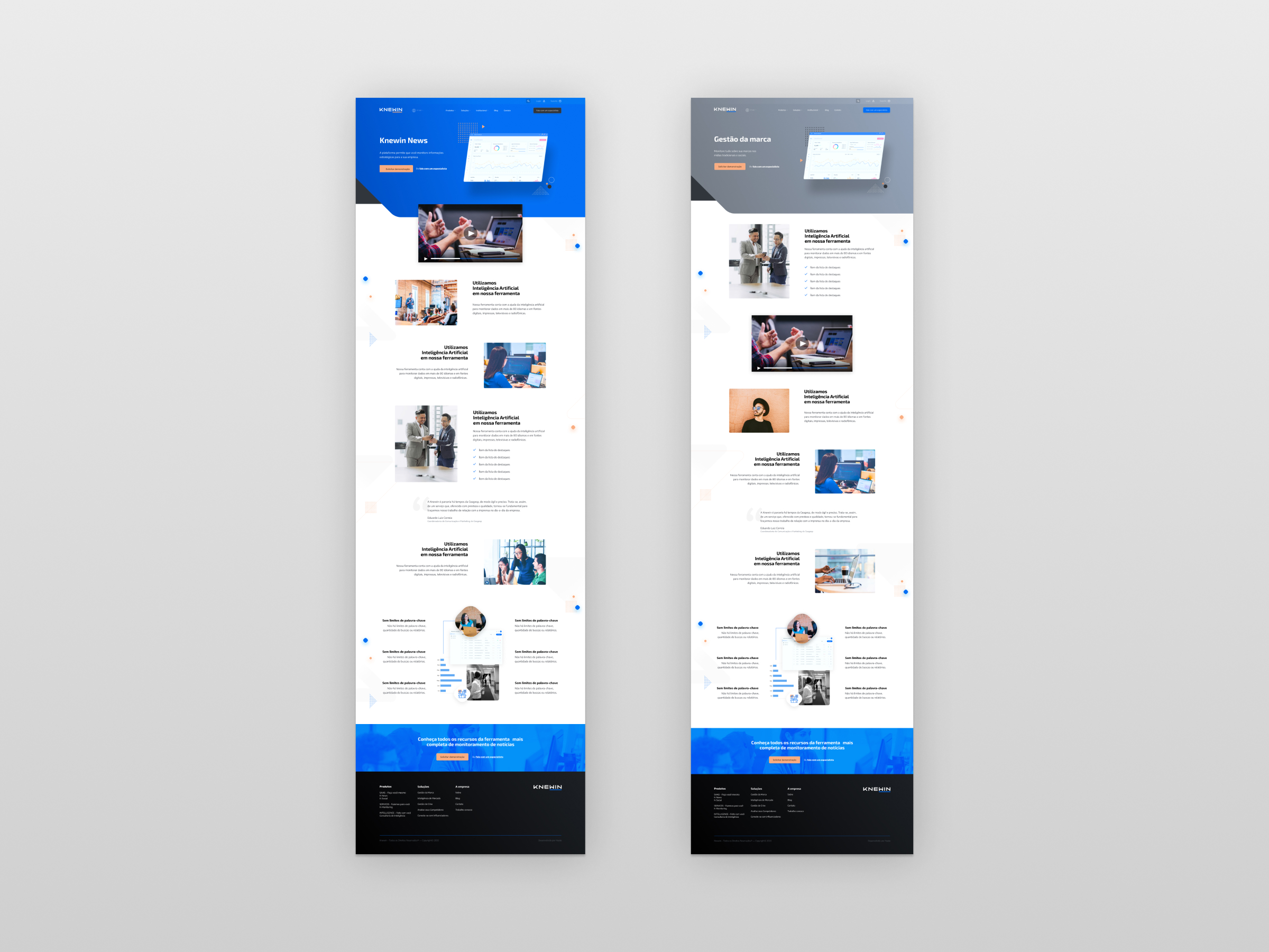
↓
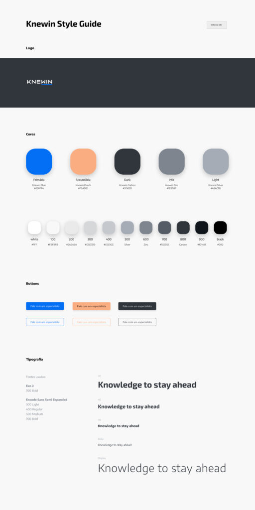
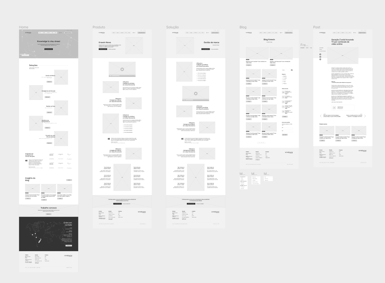
Through several cycles of visual experimentation → prototyping → feedback, using Figma for this process, I was able to create a dynamic yet cohesive interface for the website, aligned with the WordPress structure.
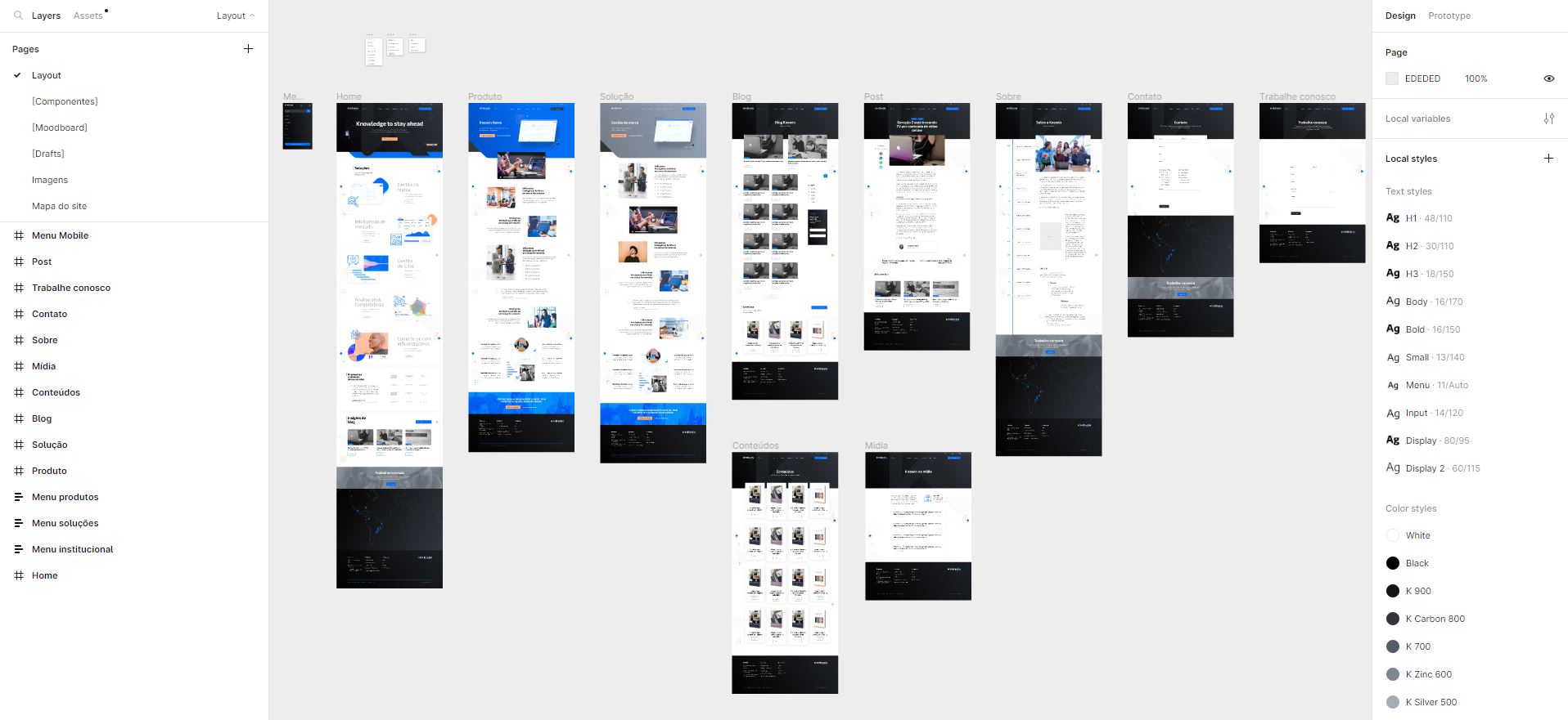
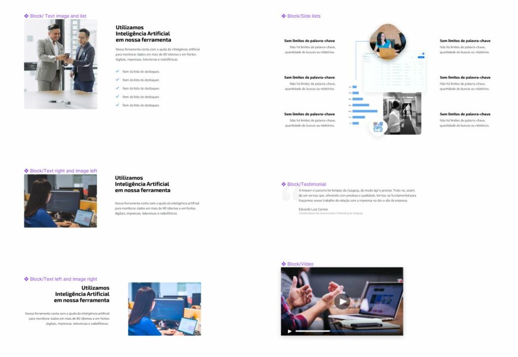
Blocks
At the time of the project, the WordPress block editor was becoming the standard way of content editing. To ensure that the new website was prepared for this, all page content was designed so that it could be built with base blocks or with block patterns that we would create as templates for clients.